
From strategy communication, brand positioning and identity through to advertising and engagement, our work is varied but robust brand thinking is always at its heart. We get to know our clients well. Each project is personal to us. We share their stories here >

Professional chemistry at its best
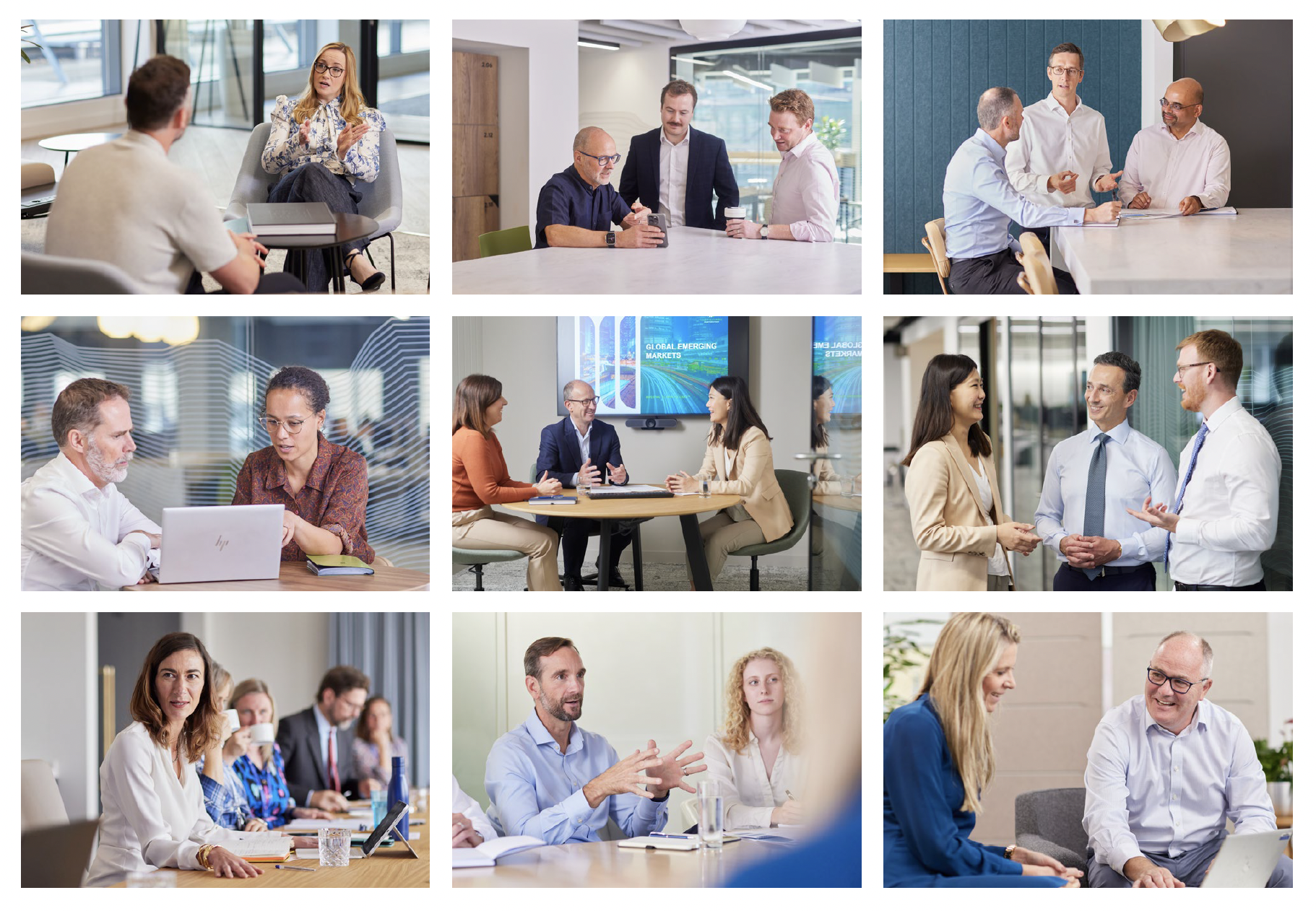
VIDEO CASE STUDIES: In professional services, everyone talks about relationships. But how do you demonstrate that working together really does feel different? Through a series of filmed client and partner conversations, we showcased the difference with Forvis Mazars.
Mazars, now Forvis Mazars, has flourished over the years on the strength of its relationships and the power of those relationships to deliver organic growth. A globally recognised name in accountancy, advisory and audit, Forvis Mazars competes alongside the Big 4 and large national practices, yet remains surprisingly under the radar for some in the UK. Under the leadership of new Chief Marketing Officer, Gemma Spiers, it was time to showcase just what’s so special about the way ‘Mazarians’ work with their clients and why their partnerships run so deep.
Brand insiders were engaged to develop a series of video case studies that would set the tone for an on-going case study programme and video series. Clients were invited to participate from regions across the UK and were enthusiastic to share insight into their working relationships and the value they bring.
Once discussion guides were drafted and locations recce’d, video shoots took place across three locations; Edinburgh, Manchester and London. Each film aimed to celebrate a client’s journey and outcomes and covered a wide range of services including wealth management, succession planning, navigating the challenges of the COVID pandemic, growth. technology, management consulting, risk consulting and forensics.
Brand Insiders looked after planning & logistics, interviews, videography, editing, copywriting and supporting still photography. Edits were produced for social media based around specific themes to support story telling. A copy written narrative was developed for each case for use in new business documentation and promotion.
Thank you to Amanda, Natalie, James, Simon, Assam, and Thomas for your willingness to be in front of the camera and for sharing your stories and experiences with us.
Pret A Manger, London


Prestonfield House, Edinburgh
Amanda Dagg, Private Client, Manchester

UK Launch for global merger
CAMPAIGN: In June 2024 we helped launch Forvis Mazars in the UK. A $5 Billion, two-firm network, it is the largest entrant into the audit & advisory top 10 global rankings in decades. We coordinated and managed a campaign featuring programmatic and traditional Out Of Home, digital and podcast audio plus direct client communications.
FORVIS MAZARS | BRAND LAUNCH CAMPAIGN
We began working with Mazars in 2023. We were appointed to explore how they might better express their proposition in the UK Audit & Advisory market. Through qualitative and quantitative research we tapped into fresh client and partner insight to set a direction for future brand promotion.
Then early in 2024 everything changed.
Together with long-term US partner Forvis, they formed a new global entity - Forvis Mazars. A $5 Billion, two-firm network, it was to be the largest entrant into the Top 10 global rankings in decades.
While the ‘ink’ on the small print of the agreement was barely dry, we got to work supporting the UK ‘Clients & Markets’ team plan and execute a tactical launch campaign in record time.
Coordinating with the Forvis Mazars global team, we developed a UK specific strategy for an advertising campaign, media plan and creative that featured London and key regional programmatic and traditional Out Of Home, digital and podcast audio, plus direct client communications.
While this is only the beginning for this newly formed brand, the campaign experienced positive engagement, bolstered awareness from the off and was proudly and positively received by the UK teams.
We look forward to supporting the brand as it establishes and matures.


Powered by performance
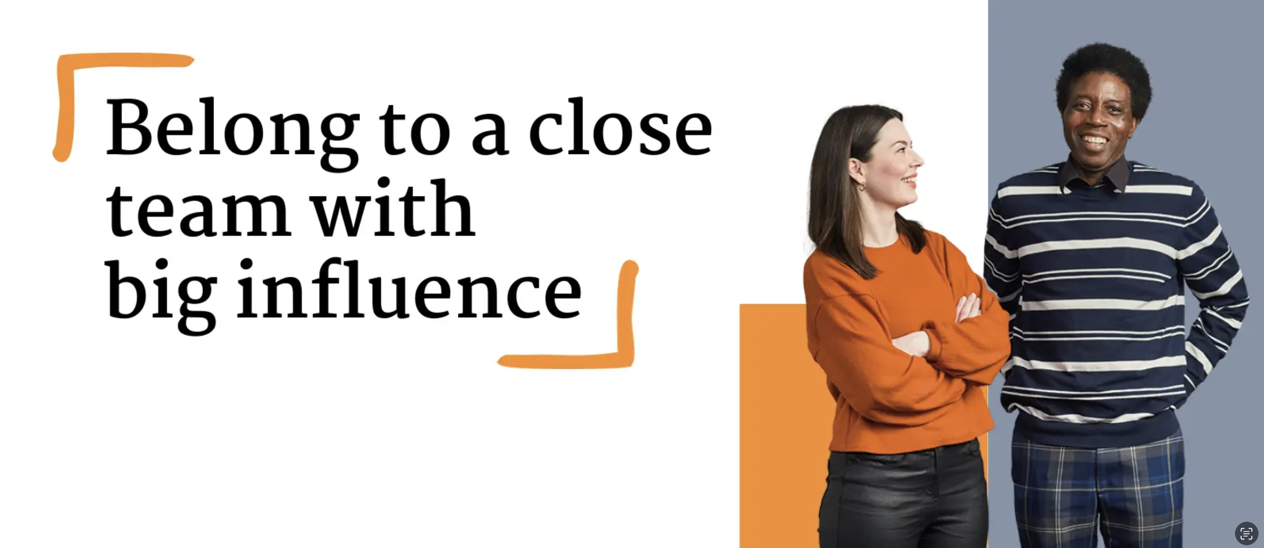
EMPLOYER BRAND: Martin Currie is a long established name in active equity investment. But it’s got a new story to tell; new leadership, new global network, a dedicated and diverse colleague community, and an innovative new product launch. It was time for a strategy, culture and positioning communication refresh.
MARTIN CURRIE | EMPLOYER BRAND
In 2023, global active equity specialist Martin Currie launched its new ‘Improving Society’ investment fund. Martin Currie believes passionately in the opportunity and advantage presented by sustainable investment in impact focussed companies. Driven by the purpose ‘Investing to improve lives’, the firm puts its money where its heart is.
But the ‘Improving Society’ fund is only part of the transformation story. Now part of asset management giant Franklin Templeton, Martin Currie is poised for new conversations and partnerships in territories around the world. And for recently appointed CEO Jen Mair, getting clear on the firm's proposition, positioning, culture and messaging is a priority for those powerful conversations.
Brand Insiders were invited to work closely with the leadership on three objectives:
Culture - bring its expression up to date with values people could rally behind
Partnerships - make it easier for Franklin Templeton colleagues to understand the firm, and for other audiences to grasp the value of the relationship
Positioning - help re-educate the market with a purpose and benefit driven narrative that reflects the firm it is today
Research across the firm’s territories in the UK, US and Australia gave us a grounding in insight. Three lively and discursive workshops inspired an expression of purpose, culture, values, proposition and market-facing communication themes that sparked pride in the team. We shared and we tested widely with colleagues who collaborated to bring the words and ideas presented into sharp focus. And after some final adjustments the story was set.
In investment, performance matters. But it's the type of performance that sets Martin Currie apart. ‘The power to perform’ became the name for a progressive strategy. ‘Partnerships that perform’ is the essence of Martin Currie’s proposition. ‘Freedom to perform’ captures its autonomous and independent culture with simple and easy to enact values: Respect, Openness and Courage (ROC - values are the ‘bedrock’ of this firm). Narratives accompanying these expressions found form in a tone of voice that is resolute, real and upbeat.
Insight from research invited a fresh approach to internal engagement - less-formal, more aligned with the personality and diversity of the firm today. An immediate overhaul of internal communications was a first priority to keep up the momentum. We defined a colleague specific design framework, with design guidance, master templates and assets. The firm’s long-standing design partner and internal teams implemented the new style across its intranet, business, HR and recruitment communications.


Tone of voice guidelines and training workshops helped Martin Currie confidently adopt the brand tone of voice and introduce more consistency in its house writing style.

Photography was a key to showcasing the firm in a fresh light. We worked with award-winning photographer Matt Davis to capture the character of real Martin Currie people and their natural interactions. With this investment, communications feel more authentic and reliance on stock photography is greatly reduced. Corporate portraits were also updated to feel more accessible and relaxed.
As Martin Currie deeply embeds itself in the Franklin Templeton family and grows its global profile, it can do so with a strong sense of identity. With confidence and conviction in its positioning that matches its high-conviction investment strategies, this ‘boutique’ firm is one to watch.
Our support to Martin Currie included:
Qualitative research
Strategic and creative workshops
Brand strategy
Organisational strategy messaging
Cultural narrative and values
Internal communication framework design
Internal communication assets, guidelines and templates
Brand messaging and positioning content
Commissioned photography and professional photography guide
Tone of voice training and writing guidelines
Intranet user interface design

Uphold ethics. Cultivate trust.
REBRAND: ICAS is a deeply respected brand by those who know it. Yet, its profile was comparatively low. It needed a brand that could position it with conviction and amplify its voice. A brand that felt vital and relevant to its members. One that matched the scale of its ambition and the energy of the ICAS team.
INSTITUTE OF CHARTERED ACCOUNTANTS SCOTLAND | REBRAND
As the world changes, the importance of doing the right thing does not.
A global membership organisation and network for chartered accountants, ICAS has stood firm to its motto ‘seek the truth’ since 1854. An educator, examiner and regulator for its profession, the business community looks to ICAS and its members to uphold standards and cultivate trust. While ICAS members wear the ‘CA’ badge with immense pride, few outside of the profession truly understand what it represents.
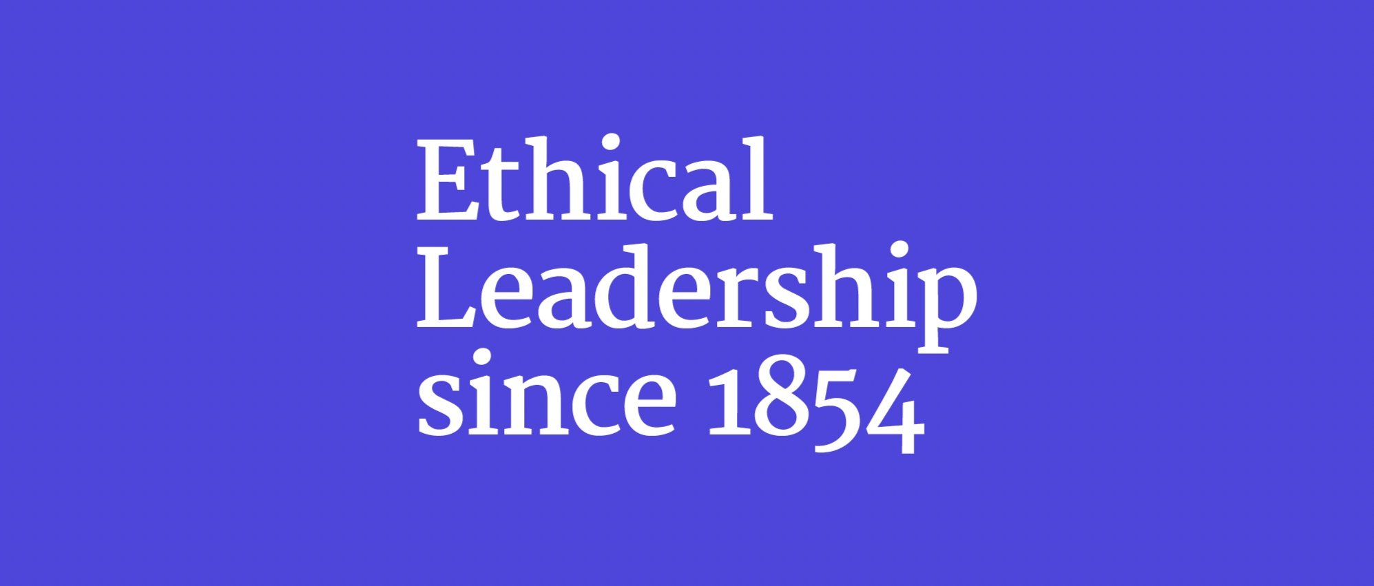
Through qualitative research, Brand Insiders set about uncovering the heartfelt principles and ambitions that drive ICAS and its member community to do the right thing. ‘Ethical Leadership’ was the universal idea that emerged.
With a renewed expression of its strategy, a fresh set of values and a clear and meaningful proposition in service of this idea, a bold new ICAS brand took shape.


Single minded in form and expression, the new ICAS identity heralds a transformation in the experience of trainees and members. An entirely reimagined digital learning platform and syllabus equips CAs to lead on the big challenges of the future. And a root and branch user-driven website redesign helps members get more from the community. With planning, consultancy and creative styling expertise from Brand Insiders, these cornerstone projects set the stage for the brand to come to life.

‘Smart, talented and from all walks of life’, commissioned photography captures the vibrant and diverse personality of ICAS’ people and makes everyone feel their best. Colleague/Employee communications, distinct in style and tone, keep colleagues connected and informed.


Member interviews, photographic portraits and video profiles celebrate the everyday and extraordinary individual stories that make the ICAS community what it is today.

Ongoing writing workshops help ICAS colleagues embrace the brand and bolster their skills. Empowered with a visual and verbal style framework that carries conviction, they can rise to the challenge of championing Chartered Accountants as the backbone of ethical business.


Over the course of two years our support to ICAS included:
Qualitative and quantitative research (members, colleagues and stakeholders)
Strategic and creative workshops
Brand strategy
Organisational strategy messaging
Cultural narrative and values
Brand identity and framework design
Brand messaging and positioning content
Commissioned photography (colleagues and members)
Commissioned videography (members)
Sonic identity and animation
Tone of voice and writing workshops
Learning platform user interface design
Website user experience and planning
Website user interface design

Pivot like a pro
CUSTOMER COMMUNICATIONS: ‘Front foot finance’. ‘Pivot like a pro’. Cash flow forecasting technology brand Float needed to find its own flow with a bolder positioning in its SME market.
Entrepreneur Colin Hewitt, had experienced his fair share of sleepless nights as a result of managing and monitoring cash flow. It’s why he founded Float. An intuitive cashflow management tool for SME business, Float gives leaders a clear picture of business finances and scenarios so they can plan, invest and grow effectively.
The team at Float were ambitious for growth. The key to this would be a better understanding of its product-market fit and messaging the customer benefits and outcomes succinctly. Brand Insiders joined a project team of leadership, marketing, product development and customer experience to refine its positioning, review the customer journey, and redefine personas. A research consultation with customers (existing, new, lapsed, churned and trialling) helped Float tune into their pain points and motivations and achieve an effective message match in communications throughout the customer journey.


Three brand themes emerged - a better way, a clearer picture, designed for growth, and each provided rich territory for storytelling. A creative brief outlined the principles, personality and tone of voice that would guide the in-house team, and bring a new dynamism to communications.


A sonic identity was developed with composer Chris Bradley to capture the personality of the brand; confident, vibrant and honest. Animated brand idents gave the in-house team consistent assets to work with across video content.
We look forward to seeing Float grow with its customers, helping them to find their financial flow.

Redefining standards
REBRAND: A new brand was a strategic commitment for Trust Housing Association. Orientated around customers and inspired by their experience, we created a new identity they could connect with.
TRUST HOUSING ASSOCIATION | REBRAND
Trust Housing Association is a social landlord with big ambition and a big heart. Now 50 years old, its 700 colleagues look after 4000 homes across the length and breath of Scotland. Over the years, the Trust family has grown in capability and scale, welcoming colleagues and customers from regional associations into its fold. But with growth comes complexity.
A changing customer demographic, an increasingly digitised customer service and new housing stock strategies are transforming its product, service and relationships. Yet the principles at its core remain true.
Trust needed a brand that deepens its relationship with customers, reiterates its commitment to them and provides reassurance. Strategically, it needed a brand to facilitate new conversations and open up opportunities for partnership and acquisition, talent attraction and broaden customer appeal.
We already knew Trust well (having worked on its digital transformation, strategic and cultural communications). So we went about getting to know its customer community better through qualitative interviews and focus groups. We captured the deeply personal value and benefit Trust tenants experience and let that be the inspiration for the brand’s strategy, narrative and messaging, with the idea of feeling ‘safe and sound’.
A warm, trusted and inclusive tone of voice matches the character of communication with the nature of its relationships.
Proposition:
Feel secure, live well. Affordable homes with exceptional services and care.
Trust | Affordable homes. Exceptional care.
Brand Themes:
New standards in service and care.
You’ll find us straightforward to contact and quick to respond. Ready and able to keep things just right. Our specialist teams work closely with you so you can access our services with ease.
A responsible landlord.
Rising living costs, social inequality and climate change are a concern for us all. We keep to fair and ethical standards, with a focus on improving quality of life. With sustainability front and centre we’re creating smarter, energy efficient homes and green communities. For everyone’s benefit.
Outstanding personal contact.
Getting to know you and your needs is what we do best. At home, online, on the phone or dropping by to get things sorted. We’ll be familiar faces. Looking after you and your home with experience, care and respect.
A sector leading innovator.
Let’s redefine standards of service and go above and beyond expectations with visionary leadership, a progressive culture, technology enabled systems and an open attitude. Extending a warm welcome to partnership and making a positive impact on our society and environment.

A new visual identity feels welcoming, friendly and captures a feeling of support and partnership (two characters - ‘r’ and ‘u’ - visually connecting). A dynamic brand style and graphic pattern represents agility and connection.


Customers feature prominently in the new visual style. A photoshoot with characters from the Trust community was filled with laughter - a day with a difference for most who took part. A group of Trust colleagues were game for being in front of the camera too. The real people profiled contributed greatly to the authenticity and colourful personality of the new brand and for that we thank them.


Trust’s existing website was no longer fit for purpose. Its commitment to make digital engagement easier for customers and the public demanded the development of a new website. We worked closely with a trusted digital development partner to bring the brand to life online.

Trust’s head offices were refitted to better facilitate hybrid working. We worked closely with their facilities team to bring the new brand into the office environment.

The rebrand journey coincided with changes in social housing regulation and the cost of living crisis. The sensitivities of brand launch in this context were very acutely felt. The importance of demonstrating value for money and legitimate and enduring benefit became vital. We supported Trust to strike the right tone as they prepared to announce and roll out the new brand. The brand launched on the association’s 50th Anniversary. A positive story and the beginning of a new era.
Over the course of six years our support to Trust included:
Digital transformation campaign and colleague communications
Business strategy naming, identity and messaging
Qualitative and quantitative research (tenants, colleagues and stakeholders)
Brand strategy and narrative
Organisational strategy messaging
Cultural narrative and values
Brand identity and framework design
Brand messaging and positioning content
Commissioned photography (tenants and colleagues)
MS Office templates and stationery
Website user interface design
Signage and interiors
50th Anniversary identity
Recruitment promotion styling and templates
Property void advertising styling and templates

Bright minds grow together
BRAND CREATION: Two Learning & Development brands became one, Emerald Works. We found synergies in colleague and customer expectations and experiences so that collectively, they might change lives through learning and coordinate their approach to growth.
EMERALD GROUP | BRAND CREATION
Brand reputation and goodwill are hard won over time. So when the time comes (and strategy demands) that a business change its name, transferring its reputation to a new brand takes care. When this applies to two established businesses as they come together under one name, the approach must be thoroughly robust.
Good Practice - a well respected and growing L&D resources business had been working with its sister business, Towards Maturity - L&D research and benchmark consultancy, for some time. Both were subsidiaries of academic publisher Emerald Publishing and part of the global Emerald Group. Collectively, they set out to change lives through learning and coordinate their approach to growth.
Brand Insiders got started the way we always do, with research. This helped us understand the experiences, perceptions and reputation attached to each brand from internal, industry stakeholders and client perspectives. A strategic workshop followed to get clear on the future relationship between the businesses and the parent Group brand and find it a name.

We found synergies between the Group positioning and culture, and those of each independent business. A brand strategy, proposition and priorities emerged. With a tone of voice that is spirited, authoritative and down to earth we penned the brand story and gave the organisation its name - Emerald Works.
Creative workshops established the brief and character for a new identity. We collaborated (almost daily, acting as Creative Director) with the inhouse design team to define a vibrant illustrative design style that provides a wealth of opportunity to animate. We commissioned a sonic identity (big thanks to composer Chris Bradley) to capture the brand’s personality in music and provide that distinctive audio hallmark across marketing and online video-based learning materials.


A programme of copywriting brought the brand’s character and proposition to life through its colleague and customer communications. ‘Reality? Check’ ‘Fresh food for hungry minds’ ‘Hit new strides in learning’. Brand messaging reflected the engaging nature of the learning experience.


.
Over a period of three years we supported Emerald Works leaders and managers through announcements, brand migration, colleague engagement, brand launch and promotion to customers and the market, worldwide.
Our work included:
Qualitative research
Strategic and creative workshops
Brand architecture and migration strategy
Name generation
Brand strategy
Brand Identity and design framework
Consultant Creative Direction
Brand guidelines
Commissioned illustration
Commissioned sonic identity
Animation / animated idents
Video and art direction
Tone of voice guidelines and training
Copywriting
Internal communication, facilitation and engagement
Brand messaging and positioning content
Website UX, planning and user interface Design
Product video suite
Signage and and interiors
Exhibition and merchandise.
Multi-channel launch campaign and activation, offline and online
Employee engagement: event session facilitations, communications,
CEO and brand explainer videos, internal brand launch